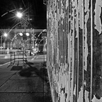
I like this b&w version best. The peeling paint definitely has character.
ozozozrod
- Saturday, 30 December 2017 at 07:07:36
I was initially attracted to your b&ws, but it did seem that there were two different themes. Having said that I agree with your choice of this one, primarily because the closer view seems to embolden the texture, even though all are 50/50 frame splits. But, then your note led me to the POD version ......
I appreciate the underlying frustrations you've faced here - thanks for persevering and showing how processing can deliver quite different interpretations.
ozozozrod
- Saturday, 30 December 2017 at 07:04:55

...... and now you've integrated the two frame halves so well. The texture's now bold through light and colour complexity - love the intense colour reflections of the corrugation ridges and obviously they owe their existence to the almost garish lights (garish in a nice way). Definitely the best of the colour versions and to my mind, "better" than the b&ws. See how open-minded the POD can be ?
PS I had been wondering when this corrugated wall would get its hands on you ever since you first showed it from across the street.
jools
- Friday, 29 December 2017 at 21:00:48
A delightful image. Nice.
jools
- Friday, 29 December 2017 at 20:43:27
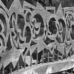
Very cool. Lovely work. I like to overall image but especially with the sand trap shape with the stars above.
jools
- Friday, 29 December 2017 at 14:18:34
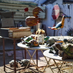
Pretty wild and cool.
jools
- Friday, 29 December 2017 at 14:03:31
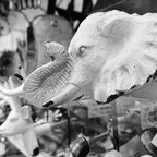
Safety in numbers. Fantastic collection and many other items to enjoy. It more than works.
jools
- Friday, 29 December 2017 at 13:46:13

Nice, real nice. A lot to feel here.
todd
- Friday, 29 December 2017 at 10:41:02
haha you made the same 'mistake' i do these days, thinking Hannah is Abigail