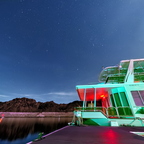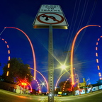
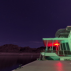
would it be better if I made the water darker? i forgot to even think about the water.. had i done so I'd at least have smoothed the blues out... it's a challenging image to work with.
Peter Moore
- Thursday, 7 December 2017 at 22:39:35
Love it! It took me a minute to figure it out. When I did I went "Oh Wow!
Topsy
- Thursday, 7 December 2017 at 21:21:26
Lots of small things I like here: The clouds over the hills, the colour of the night sky, the harmony the night sky colours create with the light illuminating the boat But the water on the left seems a bit busy/too abstract for my liking. Doesn't take away much from the image though.
Topsy
- Thursday, 7 December 2017 at 21:11:43
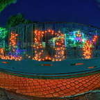
Very hard to tell which one is better.. I quite like this one because it's NOT as easy to read the "JOY". It makes you feel more clever when you see it!
ron
- Thursday, 7 December 2017 at 12:01:39
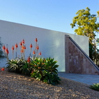
A mismatch of shapes that leaves wondering what they are for.
I even knew what the plant was, evidence of spending too much time in photo forums =)
ozozozrod
- Thursday, 7 December 2017 at 04:03:47
I recognise the site (I think) but the light's quite different. Nice balance between the red hot pokers and the trees and I like how the windows blend with the sky and trees. Perhaps a cat on top of the wall
jools
- Wednesday, 6 December 2017 at 20:45:06
Love this shot. The colors and composition are solid. That FE is simply a great lens.
Bill Struth
- Wednesday, 6 December 2017 at 20:37:53
Great use of the fisheye here I especially like on that little apron in front of the gate.
ron
- Wednesday, 6 December 2017 at 12:18:43
just looking at the map, gee we are like worlds apart.