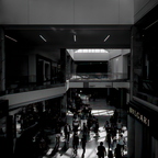
I like the off-centred geometry here as well as the people within the light games below. Another option that appeals to me is almost a square crop - retain full widteh, but remove the ceiling stuff - creates an overall darker image that concentrates the eye on the ground level and adds an air of mystery by not having the source of the main shadow pattern identified.
ozozozzrod
- Saturday, 2 October 2021 at 15:32:44
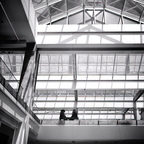
The shadow patterns are intriguing and certainly add something to the interior dynamics of the mall setting. I think I remarked before along the lines of - wondering what proportion of the people consciously think about the shadows as they walk over them, and did the architect have this impact in mind when he/she designed the building?
ozozozzrod
- Saturday, 2 October 2021 at 03:37:09
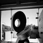
Is this a test? I know I've seen and commented on this one. It's in your July album (like the one next door) but no comments. RUOK?
ozozozzrod
- Saturday, 2 October 2021 at 03:33:04
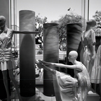
Nice combo of rounds and squares.
ozozozzrod
- Saturday, 2 October 2021 at 03:32:17
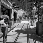
I quite like this; there's a lot of potential in mannequins, especially if you can isolate the heads.
ozozozzrod
- Saturday, 2 October 2021 at 03:30:49
What are you playing at? I know I've seen this before, but if I go back to your July album, I find it's the cover shot but not in the album itself. Perplexed.
ozozozzrod
- Thursday, 30 September 2021 at 00:58:59