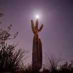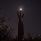
Thanks for the input. Yeah as far as the 'cleaner' aspect goes, it's due to some other contrast sharpening I had going on that I didn't turn off on 393 (I had copied the template from the darker 395 edit) but did think to turn off when I went back and did the boost on 395... You basically gave words to my exact thoughts about the difference between the two. This then leads me back to my original thought that it might work to bring some lighting onto subject, trying to find a nice middle ground....
OzzRod
- Wednesday, 4 March 2020 at 15:36:47
Two quite different images at first glance and tbh this brighter one catches my eye more strongly, ie when comparing two entire images. However my preference is for the darker one - what I perceive to be the more "real" view that I would have had on site. Artistically there's a degree of mystery/fantasy in the darker one too, which appeals to me. This frame (395) is also noticeably "cleaner" than 393.
The other thing I'm wary of in my own astro shots ... early on I was fascinated/surprised by how many more stars the sensor responded to compared to my eyes. Increasing exposure in post enhanced this, but soon revealed the noise as well. The main thing I found disconcerting though was that the familiar naked eye constellations disappeared - swamped by all the other stars. So in this one, Orion for example, is readily recognisable, even with the moon's intrusion. It's a challenging balance, complicated by varying personal preferences.
Oh yes, you gotta do more of these. Lots of fainter stars despite the moon, and some nice edge highlights on the cactus. It looks like I'm being welcomed to some mystical ceremony; at other moments "ET phone home" springs to mind. May have a hot pixel (red) near the cactus' left armpit.