First - splendido image even if not processed to your ultimate preference.
Second - another thank you - this time for the side by side comparison re. pixel shift. It's very minor to my eyes, and the value varies in different parts of the frame but I reckon the PS version is marginally "better". It required a lot of switching between the two to convince me, but my interest in using PS has been lifted a bit.
todd
- Monday, 9 July 2018 at 16:50:31
If only we'd happened upon this while there were actors around! Did see a couple adverts around and they are much more elaborately costumed than what we did in HS...
todd
- Monday, 9 July 2018 at 16:45:54
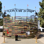
You called it. The last thing I did was to selectively saturate the blues in gimp and it went overboard/overcooked... I liked it in the moment for the extreme factor, but now it doesn't work. i'll try to remember to go back and redo it.
ozozozrod
- Monday, 9 July 2018 at 16:26:56
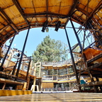
And I guess it's an expression of theatre in the round a la Globe in London (I'm just waking up).
ozozozrod
- Monday, 9 July 2018 at 16:24:14
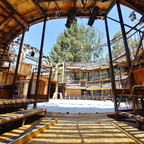
Wonderful framing in this one.
ozozozrod
- Monday, 9 July 2018 at 16:23:10
Thank you! Now everything falls into place - normality has returned!
ozozozrod
- Monday, 9 July 2018 at 16:21:30
Haha, it's multi-coloured swans!
ozozozrod
- Monday, 9 July 2018 at 16:18:45
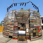
I gather that this is some sort of performance space? I didn't recognise the furthest extension of it at first and was puzzling over the size. The battery of spotlights didn't seem to match but once I got right through the entrance and beyond the centre space, all was OK. And what is the significance of the three black swans on the left?
ozozozrod
- Monday, 9 July 2018 at 16:06:17
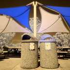
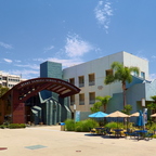
Looks a nice campus with the newer adventurous architectural pieces. Given you some good yellow/blue combos to work with.
ozozozrod
- Monday, 9 July 2018 at 15:59:10
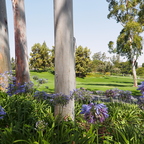
Quite incongruous floristically, seeing the combination in natural colour.